 Github Stars:
 Last Commit:
  Created:
Overview
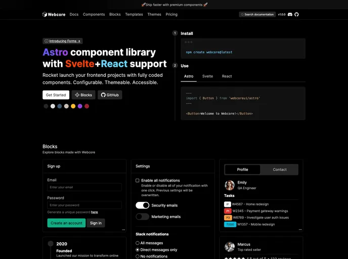
Webcore presents a dynamic and versatile component library designed for seamless integration with popular front-end frameworks like Astro, Svelte, and React. Whether you’re starting a new project or enhancing an existing one, Webcore makes the process straightforward, allowing developers to build engaging and responsive user interfaces with ease. Its robust architecture and strong reliance on Sass for styling ensure that you not only have powerful components at your disposal but also the flexibility to customize them according to your needs.
The installation and setup of Webcore are user-friendly, making it accessible even for those who are just getting started with web development. With a simple command, you can get your project up and running, offering a streamlined pathway to leverage its full potential right away.
Features
Framework Compatibility: Easily integrate with Astro, Svelte, or React ecosystems to enhance your existing projects or launch entirely new ones.
Sass Styling: Leverage the power of Sass for styling, allowing for sophisticated design capabilities and easy maintenance of styles across your components.
Flexible Setup: Quickly set up your project by creating a
webcore.config.scssfile and customize default styles with a few simple commands.Utility Classes: Includes an array of utility classes for CSS, providing additional styling options without cluttering your style sheets.
Component Variety: Offers a comprehensive list of pre-built components, including alerts, modals, buttons, and more, which can be directly imported and utilized in your applications.
Customizable Reset Styles: Tailor your reset styles to suit your aesthetic preferences, with options to include or exclude them as needed.
Tooltip and Scrollbar Styles: Enhance user experience with built-in tooltip styles and the ability to customize scrollbar appearances.
Rich Documentation: Access full documentation online, ensuring you have all the resources needed to effectively use and implement Webcore components.


