 Github Stars:
 Last Commit:
  Created:
Overview
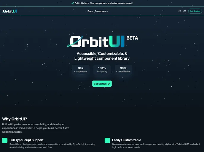
OrbitKIT is shaping up to be an exciting addition to the toolkit for developers working with Astro. As a customizable, lightweight component library, it aims to provide ready-to-use components powered by Tailwind CSS, with a focus on improving development speed without sacrificing performance or adding unnecessary overhead. The project is still in its active development phase, making it a work in progress, but its potential is already evident for those looking to streamline their static website creation.
This library was born from the need for reusable components that do not rely on heavy frameworks like React, particularly for simpler interfaces. The creator’s vision is clear: to offer a resource that alleviates the burden of building components from scratch and to elevate the experience of crafting content-rich websites with ease.
Features
- Modular Component Library: A collection of pre-built components that can be freely mixed and matched to suit your project’s needs while enhancing development efficiency.
- Tailwind CSS Powered: Takes advantage of Tailwind CSS for easy customization, allowing for a unique design without the complexity of hidden dependencies.
- Focused on Astro: Specifically designed for use with Astro, ensuring that you don’t have to deal with the overhead of unwanted frameworks.
- Active Development: OrbitKIT is continually evolving, with opportunities for contributions, making it a community-driven project that welcomes input from developers.
- Future Interactive Components: Exciting developments are planned for interactive components requiring JavaScript, such as modals and dropdowns, broadening its usability.
- Framework Bridge Exploration: Future compatibility with popular frameworks like React, Vue, and Svelte is being explored, making it versatile and adaptable for various projects.
- Transparent Documentation: While documentation is still being enhanced, there is already a focus on clarity and accessibility for developers.
- Open for Contributions: The project invites devs to contribute, which fosters a collaborative environment and ensures the library aligns with user needs.


